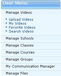


We will make it using Ajax accordian pane.
Following is the format.
<cc1:Accordion ID=”TeacherAccordion” runat=”server”>
<panes>
<cc1:AccordionPane ID=”AccordionPane1″ runat=”server”>
<Header> Manage Videos </Header>
<Content>
//Here all your contents goes
</Content>
</cc1:AccordionPane>
</panes>
</cc1:Accordion>
2. Now this is sample code with full action
<cc1:Accordion ID=”TeacherAccordion” runat=”Server” ContentCssClass=”dividera” HeaderCssClass=”divider” SelectedIndex=”0″ FadeTransitions=”true” TransitionDuration=”250″ FramesPerSecond=”40″ RequireOpenedPane=”false” SuppressHeaderPostbacks=”true”>
<Panes>
<cc1:AccordionPane ID=”AccordionPane1″ runat=”server”>
<Header> Manage Videos </Header>
<Content>
<a href=”UploadVideos.aspx”>Upload Videos</a><br />
<a href=”MyVideos.aspx”>My Videos</a><br />
<a href=”MyFavoriteVideos.aspx”>Favorite Videos</a><br />
<a href=”SearchVideos.aspx”>Search Videos</a><br />
</Content>
</cc1:AccordionPane>
</Panes>
<Panes>
<cc1:AccordionPane ID=”AccordionPane2″ runat=”server”>
<Header> Manage Schools </Header>
<Content>
<a href=”JoinSchool.aspx”>Join School</a><br />
<a href=”SearchSchool.aspx”>Search School</a><br />
</Content>
</cc1:AccordionPane>
</Panes>
</cc1:Accordion>
- SelectedIndex – The AccordionPane to be initially visible
- HeaderCssClass – Name of the CSS class to use for the headers. This can be either applied to the Accordion as a default for all AccordionPanes, or an individual AccordionPane.
- HeaderSelectedCssClass – Name of the CSS class to use for the selected header. This can be either applied to the Accordion as a default for all AccordionPanes, or an individual AccordionPane.
- ContentCssClass – Name of the CSS class to use for the content. This can be either applied to the Accordion as a default for all AccordionPanes, or an individual AccordionPane.
- FadeTransitions – True to use the fading transition effect, false for standard transitions.
- TransitionDuration – Number of milliseconds to animate the transitions
- FramesPerSecond – Number of frames per second used in the transition animations
- AutoSize – Restrict the growth of the Accordion. The values of the AutoSize enumeration are described above.
- RequireOpenedPane – Prevent closing the currently opened pane when its header is clicked (which ensures one pane is always open). The default value is true.
- SuppressHeaderPostbacks – Prevent the client-side click handlers of elements inside a header from firing (this is especially useful when you want to include hyperlinks in your headers for accessibility)
- Panes – Collection of AccordionPane controls
- HeaderTemplate – The Header template contains the markup that should be used for an pane’s header when databinding
- ContentTemplate – The Content template contains the markup that should be used for a pane’s content when databinding
- DataSource – The data source to use. DataBind() must be called.
- DataSourceID – The ID of the data source to use.
- DataMember – The member to bind to when using a DataSourceID
These are very basic things for asp.net accordian pane. Hope you will find it helpful.
Thanks Tahir Rauf
